Reason redefine what a digital marketing agency does. Their sweet spot is where science meets marketing. They’re all about hypotheses and testing. Reason are always improving and trying new things. Basically, they run towards the hard and difficult stuff. The result? Incredible. They push their clients towards bigger goals and achieve growth that was previously unknown.


Uprise had experienced incredible growth over their first 13 years. They now had two offices, one in Wellington and one in Auckland, and a growing team. They had outgrown their name and they needed a new brand identity that reflected where they were going. A brand with flexibility, a brand with an edge, and a brand that hinted at the possibilities of their own unknown growth ahead.
We built a robust brand strategy with a galvanising new brand idea at its heart. Using our key brand insights, we developed naming territories and explored new names that drew on the brand strategy. And we landed on a name that was just right: Reason. Because they never stop asking why and there’s always a reason behind everything they do.
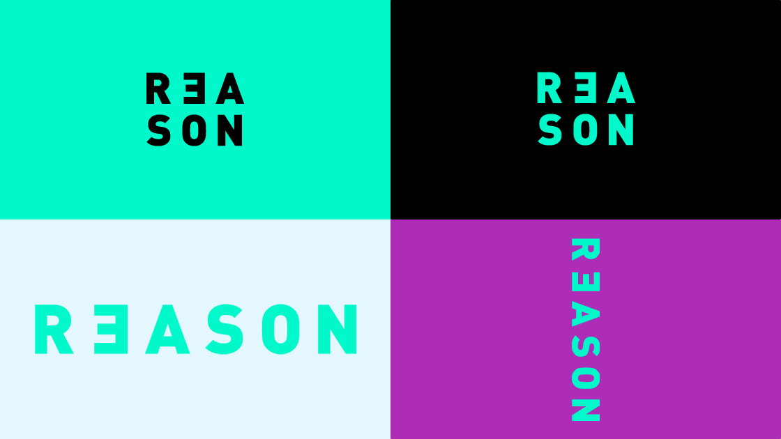
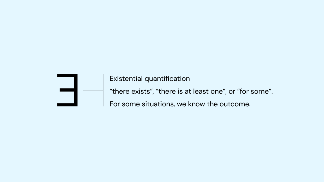
The visual identity had MFI and reason at its core. The logo mark is simple and bold with a backwards ‘E’ to represent the logic and reasoning behind their approach.
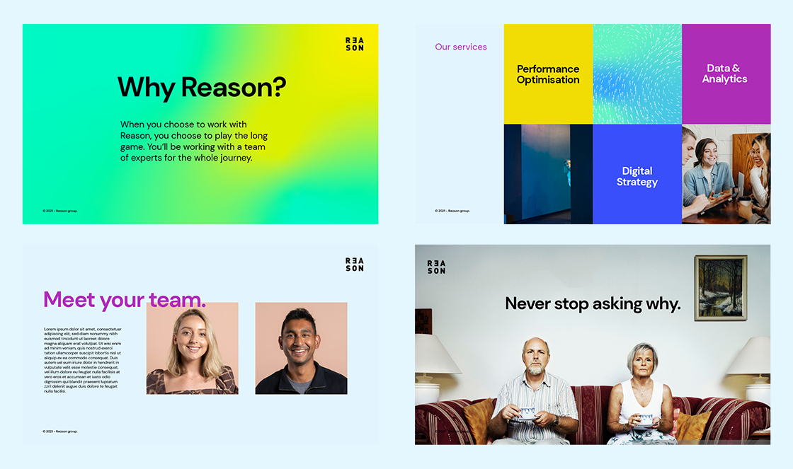
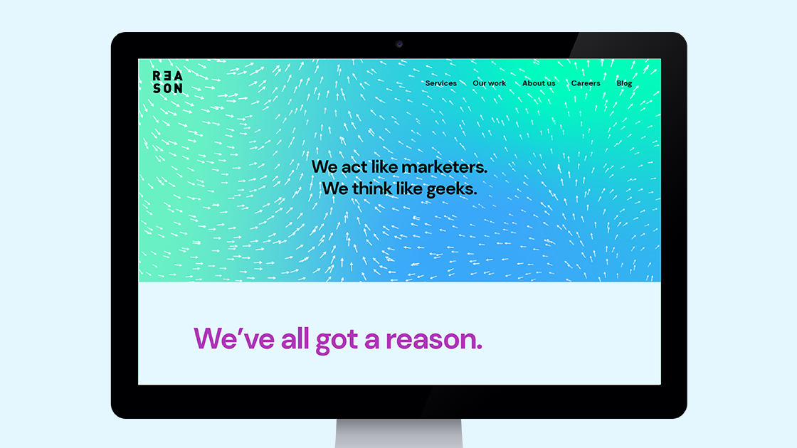
To reflect Reason’s unique modelling and prediction approach, we created a programme that generates brand graphics inspired by vectors of nature. To balance this and reflect their humorous and playful side, we gave Reason a photography style with a slightly awkward, quirky character.
The result? A confident and intelligent visual identity with a slight edge. Just the thing for the agency that prides itself on being ahead of the pack.


"I really wish the creative folk at Ocean would write this for me, but they flat-out refused. That's kind of their style though, they push for what's genuine and disregard everything else. It's what they're best at and why we've worked with them for over 10 years and trust them with our brand."
Tim Pointer, CEO & Founder, Reason.


